 Empowering you with knowledge Empowering you with knowledge
CSS is a powerful tool for designing and styling web pages. One of its many capabilities is the ability to create shapes, from simple circles and squares to more complex polygons and curves. In this article, we’ll explore how to create both basic and advanced shapes using only CSS.
Let’s start with some simple shapes. To create a circle, we can use the “border-radius” property to round the corners of a square element. For example:
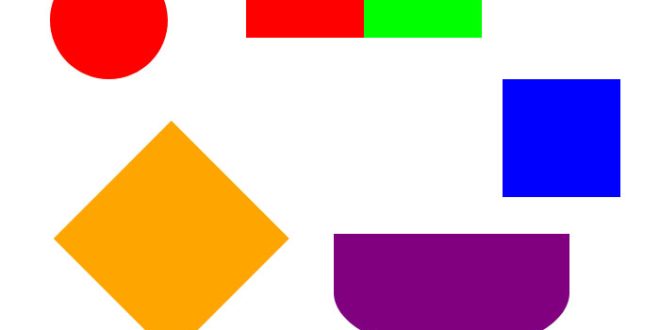
Circle
.circle {
  width: 100px;
  height: 100px;
  border-radius: 50%;
  background-color: red;
}
Result
This will create a red circle with a diameter of 100px.Square
.square {
  width: 100px;
  height: 100px;
  background-color: blue;
}
Result
This will create a blue square with sides of 100px.
Creating Advanced Shapes
Now let’s move on to some more advanced shapes.
Polygon
To create a polygon, we can use the “clip-path” property to specify a custom shape for an element. For example:
.polygon {
  width: 200px;
  height: 200px;
  background-color: orange;
  clip-path: polygon(0% 50%, 50% 0%, 100% 50%, 50% 100%);
}
Result
This will create an orange polygon with four sides, each connecting two opposite corners of the element.
Curve
To create a curve, we can use the “border-radius” property in combination with the “overflow” property to clip the corners of an element. For example:
.curve {
  width: 200px;
  height: 100px;
  background-color: purple;
  border-radius: 0 0 100px 100px / 0 0 50px 50px;
  overflow: hidden;
}
Result
This will create a purple curve with a radius of 100px on the bottom corners and a radius of 50px on the top corners.
Two Different color in One shape
You can split the shape into 2 differrent color. There are a number of ways to do this, but by using CSS Background Gradients on the container, the solution is only a few lines of code away. i used to create a rectangle shape with two different colors, you can use CSS to apply a gradient background to the shape. Here’s an example CSS code snippet that creates a rectangle shape with a gradient background:
.rectangle {
  width: 200px;
  height: 100px;
  background: linear-gradient(to right, #ff0000 50%, #00ff00 50%);
}
Result
In this example, the rectangle shape has a width of 200px and a height of 100px. The background color is created using a linear gradient that starts with a red color on the left side (0%) and transitions to a green color on the right side (100%). The 50% value in the linear-gradient function indicates the point at which the colors should transition.
You can adjust the percentage values in the linear-gradient function to change the position at which the colors transition and create different split effects. Additionally, you can add other CSS properties to adjust the border, padding, and positioning of the rectangle shape to achieve the desired look and feel.